Historian and Gallery tour guide John Ward reflects on Manchester’s paintings from the Dutch Golden Age
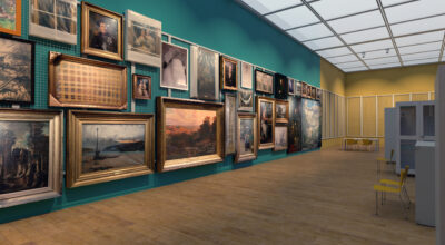
To step into our Dutch galleries is to be whisked back into the seventeenth century Netherlands – one of the most exciting and culturally rich ages in the history of any country. More than sixty paintings are on display here and we are privileged to have one of the largest collections of such works, outside London.
Answering questions from a curious gallery visitor, John guides us through some of the key works in this collection.
But surely, The Netherlands is quite a small country?
Geographically it may appear small, but for a few decades during the seventeenth century, the Dutch Republic was the greatest naval and maritime power in Europe. It had only recently fought a lengthy war of independence from Spain and its nascent state together with the fact that much of it had been reclaimed from the sea, had emboldened its people with a powerful foundation myth.
You’ve mentioned the ‘Dutch Republic’ – I always believed Holland to be a kingdom
It is indeed a kingdom – but has been so only since 1815. In the seventeenth century it enjoyed a unique status among the great European powers as a republic. But it was also ahead of its time in so many other ways. Proportional to its population, it had the largest middle class of any country and its high literacy rates reflected the large number of printing presses there. An unusually tolerant climate enabled ideas to circulate freely and by the middle of the century, Amsterdam had become Europe’s most cosmopolitan city.
This is all very interesting – but what does any of it have to do with painting?
A buoyant art market needs potential customers with sufficient disposable incomes and in the case of the Dutch Republic, these were delivered by its spectacular growth in prosperity. Additionally, there would have been an enhanced sense of personal, family, civic and national identity. The demand for capturing such qualities on canvas expanded very rapidly and it is believed that at the height of the Golden Age, as many as 70,000 paintings a year were flying off the easels of Amsterdam, Rotterdam, Haarlem, Leiden, Delft and Utrecht.
But why ‘Golden Age’ – what was so special about it?
Holland during the seventeenth century was responsible for many innovations in landscape, seascape and still life painting, thus reflecting ever-expanding horizons in the imagination. Portraits seemed to capture more effectively, the essence of the human condition while genre paintings (scenes from everyday life) ingeniously combined hilarity with moral lessons on the frailties of human nature.
How exactly does Manchester Art Gallery come to have such a large Dutch collection?
Some were purchased and others, generously bequeathed over the years. But the vast majority of them are part of the extensive Assheton Bennett Collection that was formally left to Manchester Art Gallery in 1979. It remains one of the most important bequests ever made to a regional gallery. While nearly all the paintings are from the Dutch Republic, several do originate from Flanders (in present day Belgium).
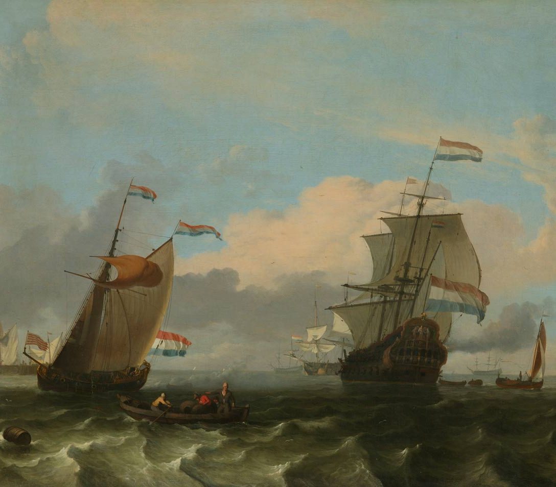
Seascape with Men of War and Smaller Vessels – Ludolf Backhuysen (1670s)
There seems to be a strong sense of expectation here – as though something dramatic is about to happen
Few artists could capture the tension and danger in the relationship between sea and warship as grippingly as Ludolf Backhuysen. Here he has achieved that foaming and turbulent effect noticeable when successive waves seem to catch up with one another. He evokes both the energy of the water and the interplay of light upon it. The shapes of the flags and sails hint at the presence of a stiff breeze, while the combination of blue sky and looming dark cloud suggests uncertainty in the weather.
But what about the large ship closest to us – she seems to have a name on her stern
Her name is ‘De Vrede’ (ironically translating as ‘The Peace’) and in her day, she was a state of the art warship. The First Anglo-Dutch War (1652-54) had not gone at all well for the Dutch Republic and ‘De Vrede’ became a prototype for a vast naval rebuilding program that in turn led to much greater success in the Second Anglo-Dutch War (1665-67).
Do we know what became of her?
We know that she played a key role in the psychologically devastating raid on Chatham and the River Medway in June 1667. Indeed, she was responsible for destroying the defences at Upnor Castle and thus helped to spread panic right across London. Thereafter, her fate is unclear. We know that an old fireship named ‘Vrede’ appeared at the Battle of Solebay in 1672, during the final Anglo-Dutch War. The thought that at the very end of her life, our ship here managed one final gesture of defiance towards the enemy may be fanciful – but it is also intriguing!
You’ve mentioned three ‘Anglo-Dutch’ wars – why were there so many?
Overseas colonies together with trade in silk, spices, porcelain, sugar and tobacco had become the lifeblood of both countries and there were huge commercial interests at stake. Merchant ships inevitably needed armed protection and in the climate of the time, jealousy and conflict between two such large naval powers were always likely.
Why were marine paintings so popular during the Golden Age?
Backhuysen presents ‘De Vrede’ as merely the first in a line of warships extending far into the distance. The profusion of Dutch flags reaffirms the sense of national prestige and the whole composition would have provided a comforting reminder of Holland’s maritime identity and prowess. One can quite easily imagine it being proudly displayed in say, a merchant’s house, to be admired by visitors. They certainly would have appreciated the sense of occasion depicted here. De Vrede’s imminent departure is being heralded both by the smaller vessel and the man who is calling to us from the rowing boat. Her gun ports are open and she is ready to join the line. She is in every sense, a ship of destiny.

Storm off the Dutch Coast – Jacob Van Ruisdael (1660s)
‘Ruisdael’ – I’ve heard that name somewhere.
Jacob was the nephew of the Salomon Van Ruysdael (note the slightly different spelling) who specialised in river scenes. We also have two fine examples of the uncle’s work.
But surely, Jacob was a landscape painter – what we have here is a seascape
Yes indeed and that is what makes this painting so remarkable. Jacob Van Ruisdael was one of the Dutch Republic’s greatest and most prolific landscape painters. But his seascapes are few in number and our Storm off the Dutch Coast is known for being one of the most spectacular.
The sailing vessels seem to be playing a merely supporting role this time
The central characters are definitely not the boats nor indeed anything human or manmade, but rather the burgeoning black clouds, the storm force winds and the potentially destructive waves. The flimsy wooden jetty and the figures who stand upon it, all seem to be seriously challenged by the experience whilst the old and broken wooden posts to the right suggest that this is a battle with the shore that the sea has won many times. We see almost nothing of the people on board the ship and their difficulties are left entirely to our imagination.
The sea appears strikingly different from the way it has been shown in the Backhuysen painting.
“Transform the sea into fire” had been the advice of artist and art theorist Samuel Van Hoogstraten and in our painting you could well believe that the water is capable of consuming just about anything it touches. Television historian, Simon Schama has suggested that there was something in the seventeenth century Dutch psyche that craved the sense of excitement and mortal danger inherent in such works.
I’ve heard that Dutch paintings from the seventeenth century often contain secret meanings or hidden messages
It could well be that for example; an endangered ship has been included not only for dramatic effect but also for its symbolic significance. And so some have likened it to a human soul in peril or perhaps a nation state fighting for survival. Similarly, the beacons located on the wooden jetty have been interpreted as sources of moral guidance in times of difficulty. But experts advise us that great care is needed in this kind of venture and that we can never be certain. There may well have been meanings that were quite clear to people living at the time, but which have been hidden from ourselves by the passage of the intervening centuries.
Why is this painting displayed in Gallery 4 (Natural Forces: Romanticism and Nature), well away from the rest of the Dutch collection?
It has been deliberately placed there because it seems to anticipate themes that would appear in British art by the early nineteenth century. Goethe, the great German poet of the Romantic Age, was a huge admirer of the artist’s work and declared it to be a kind of poetry. A similar Ruisdael composition, Stormy Weather over a Dyke in Holland, hangs in the Louvre and during his first visit to Paris in 1802; JMW Turner repeatedly sketched it. The young Englishman was moved by Ruisdael’s “heavy somber grey sky” but found his sea “too brown to allow the idea of it being liquid”. Turner would become well known for his mercurial and translucent seas of the sort that we see in Manchester’s majestic Passengers Going Onboard (located close by). It dates from 1827 and in the same year he also completed Port Ruysdael, a work in which Turner’s spa-like water again features prominently. But the composition itself stands as a tribute to the Golden Age artist who had inspired him so deeply.

Kalf, Willem; Still Life: Fruit, Goblet and Salver
Still Life with Goblet and Salver – Willem Kalf (1660s)
‘Still Life’ – surely that’s a contradiction in terms, isn’t it?
The term makes more sense when we remember that it is derived from the Dutch ‘still-even’ – literally, ‘motionless nature’. In these paintings we see arrangements of inanimate objects, be they manmade or taken from nature, and it was a genre at which Dutch and Flemish artists exceled. To become absorbed in such a work is to gain an insight into the seventeenth century mind.
There is something surreal in the way in which the carved lemon zest appears to be spiraling towards us.
This is an effect that occurs so frequently in Dutch still lifes that one could be forgiven for thinking that it was all part of a long running competition. But for Kalf it was a particular favourite. Perhaps we are being reminded that the lemon’s fragrance conceals an underlying bitterness and that we should always guard against the allure of outward appearance. Equally, the cutting of the fruit has rendered it perishable thus providing a metaphor for the passing of time. Either way, the illusion connects the painting’s world to our own and so conveys a timeless wisdom across the centuries.
Is this a purely random arrangement, or is there significance in the particular objects chosen?
In one sense, the painting reads like an advertisement for the enormously powerful Dutch East India Company. The luxurious carpet may very well have come from Persia or India and the mother of pearl handled knife, from China or Japan. The wines and Seville orange would have been imported from Mediterranean Europe but the Dutch name for the latter, ‘sinaasappel’ (China-apple) is an oriental reference that would not have been lost on a discerning purchaser. The silver salver could at least in part, be a reference to the momentous day back in 1628 when off Cuba, the entire Spanish silver fleet had fallen intact, into the hands of the Dutch West India Company. The ornately designed roemer glass was very much a specialty of Dutch craftsmanship and this seems to be underlined by its commanding and compass like position.
What kind of person would have paid for a work like this, and for what purpose?
The buyer may have achieved or at least aspired to, the level of luxury represented and we can certainly imagine them longing to caress something that appears all too real. But the painting would also have provided a source of ongoing reflection – upon the essential transience of things and the notion that in the end, all worldly gains will count for nothing. Such musings may very well have been deepened by the presence of the wine and its inevitable link to thoughts of salvation.
There seems to be something magical about the way in which the artist has illuminated the scene.
Even by the high standards of the time, Kalf’s handling of reflected light is especially admired. Immediately below the rim of the central glass we can just make out the image of a window, whilst just above its spangled stem we can see that it has also caught something of the texture of a whole lemon. Meanwhile, on the far left of the salver, we can see the image of a lemon section and immediately we wonder whether this is a carefully carved slice or an improbable reflection. The white wine has enabled a tiny gleam of gold to fall on to the opposite side of the salver. But what about the right hand side of the composition? The red wine in the flute glass and the floral patterned carpet seem to have a warm eerie glow all of their own and this completes our sense of illusion. The fact that everything seems to emerge from the darkness simply deepens the mystery.
Still life painters of the Dutch Golden Age were especially mindful of the Greek aphorism, “Life is short, but Art endures”. And so it does in this wonderful Manchester example. Even though the treasures depicted have long since vanished, along with the world from which they came, our painting here will always be ready to promote thought, meditation and a shared love of beauty.
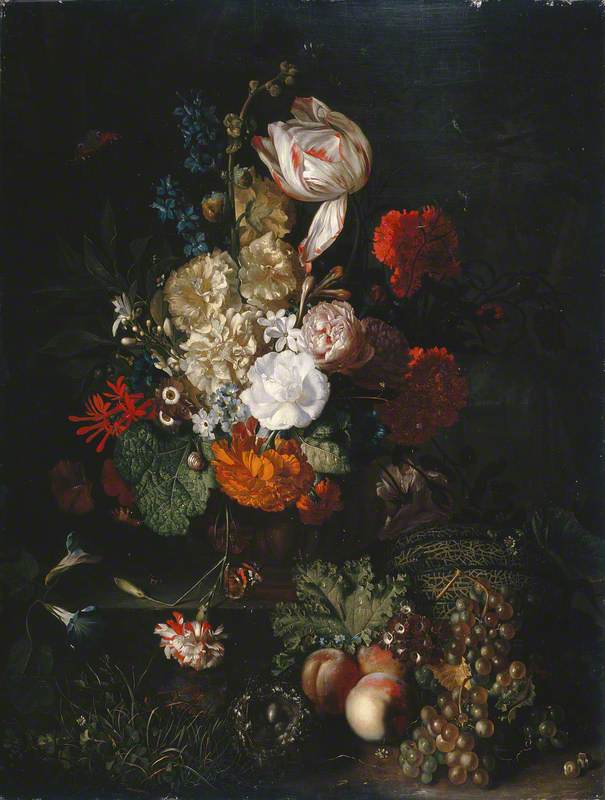
van Huysum, Jan; Still Life: Flowers and Fruit
Still Life: Flowers and Fruit – Jan Van Huysum (within 1700-20)
Surely, some of the flowers here – the tulip, hollyhocks, roses, carnations, delphiniums and convolvuli – flower at different times of spring and summer. How on earth has the artist managed to include them all within the same painting?
The ‘impossible bouquet’ had been a recurring illusion in Dutch flower painting throughout the seventeenth century. Van Huysum always worked from his many detailed sketches of flowers thus enabling him to assemble a composition that would defy the seasons. We also know that he would introduce into the same work, flowers that were currently in bloom and which he was therefore, able to paint directly. In this way, he draws us into a pleasantly eerie parallel world.
What exactly was it about the Dutch Republic that enabled it to take such a lead in this kind of painting?
Holland’s expanding seaborne empire had enabled an astonishing variety of new plant species from warmer climes to be transplanted into Dutch gardens. Equally, the intellectual climate in the country accelerated scientific investigation and so a very early form of botany soon took shape. Indeed, there was a botanical garden in Leiden as early as 1610. In a country with such an established tradition in painting (this was also true of the Spanish Netherlands – present day Belgium), the sudden proliferation of colour and exotic forms would have fired the imaginations of many artists.
I have seen from some Pre-Raphaelite works that the Victorians were great ones for ‘the language of flowers’ – was the Dutch Golden Age similar in this respect?
We know from Shakespeare that the seventeenth century mind readily attached symbolic significance to flowers. However, the conventional wisdom is that in Dutch floral paintings, we should not try to search for messages in every single species. Rather it is for us to contemplate the overall meaning of the work. This may very well be to do with divine revelation or perhaps, the beauty of creation and rebirth. This particular resonance is further strengthened by the inclusion of ripened fruit as well as a bird’s nest. Equally, we might find ourselves reminded of the transience of life or the celebrated ability of art to capture the intricacies of nature. This said, the inclusion of the red and white Semper Augustus tulip (whose distinctive flamed effect was caused by a viral infection of the bulb) is often taken as a solemn warning against folly. It was precisely this variety that had fuelled the notorious tulip mania of 1637 and the widespread financial ruin that followed in its wake.
What about the butterflies – have they been included merely for decorative effect?
The inclusion of butterflies within a still life is often seen as a reference to renewal, transience and freedom of the spirit. Indeed in Greek, the word ‘psyche’ means both ‘spirit’ and ‘butterfly’. However, in Rainbow Dust: Three Centuries of Delight in British Butterflies (2015) naturalist Peter Marren points out how in Dutch still lifes, the Red Admiral will never be found on the main posy. Instead it will always flutter close to a decaying bloom, giving it an unsettling association with death. It is striking how in our painting, the said butterfly can be seen perching on the broken stem of a dying carnation. Careful examination will reveal two further species – the Peacock and the Small Tortoiseshell – lurking in the darkness. Both are believed to carry moral symbolism.
I’ve heard Jan Van Huysum described as the greatest of all Dutch flower painters – what is so special about him?
The earliest Dutch floral still lifes were ambitious in that they would combine numerous different flowers, in all their diverse beauty, into formal and symmetrical arrangements. With Van Huysum’s work however, there is a much greater emphasis on both depth and movement. Behind the main bouquet (in which the flowers are at different stages of growth and decay) there is a partially hidden world that the gaps between the blooms and stems encourage us to explore. In these we will always discover additional flowers, tendrils, tiny insects and drops of dew. Below, the grasses and wild flowers provide a forest floor effect and an intriguing continuum between the cultivated blooms and the encroaching power of nature. We are therefore witness to something much more complex and energetic and it is remarkable just how endlessly this painting will repay repeated viewing and reflection. In 1750 (the year following the artist’s death) he became known as ‘The Phoenix of Flower Painters’.
Which brings us to the date – it’s from a slightly later time than our other Golden Age paintings.
1672 is known in Netherland’s history as the Rampjaar or ‘Year of Disasters’. Costly wars against both England and France combined with severe political turmoil at home led to a steep rise in taxation. This in turn severely affected the art market and it is at this point that Dutch painting seems to have lost its innovative edge. Paradoxically though, in Van Huysum’s work during the early decades of the eighteenth century, floral painting would reach its zenith, as it complemented very well the French rococo interiors that had recently found favour with Amsterdam’s patricians. He was thus able to command higher prices than any Dutch artist before him and so our painting here extends Manchester’s own Dutch Golden Age spectacularly.
Merry Company – Pieter de Hooch (about 1668 -70)
As I look at this, I feel as though I’m intruding upon a private scene – rather like a voyeur.
Dutch genre paintings in their almost photographic representation of everyday life have been described, perhaps misleadingly, as ‘seventeenth century reality television’ – as though they can provide a portal into typical daily and intimate situations from the time. In this case, we see a gentleman who is enjoying the convivial company of two ladies and it would seem that empty glasses are about to be replenished. On a deeper level though, we do find once again that there are layers of meaning, uncertainty and illusion to explore.
And so what exactly might we easily miss?
The manner of the woman who is standing would seem to be a little too familiar for her to be a servant, although we cannot be certain. The man has just gathered a glowing coal from the fire so that he can light his pipe. Closer scrutiny though reveals that the tongs with which he is holding the coal have been pointed indelicately towards the outstretched glass held by the seated woman. The possible symbolism of this is perhaps best left to our imagination but our sense of curiosity is deepened by the fact that we cannot see her face. Just in case the warning against sensual excess should go unheeded, the whole scene is presided over by a copy of the Rubens’ masterpiece, The Drunken Silenus.
The darkened interior would be entirely in keeping with the secretive nature of the meeting?
Yes indeed and it is this that makes the light that streams in from the back all the more startling. Even within the room we can see that the faces, dresses, wine bottle, chandelier, Turkish carpet and marble floor tiles have all been illuminated though we are left feeling intrigued as to how precisely this has been possible.
The décor does seem to be rather luxurious for a domestic setting.
It has been noted that genre paintings began to feature a greater degree of opulence from around the middle of the century and historians have related this to the final peace with Spain that the Dutch Republic had signed in 1648. However, all is not quite as it seems. The red and white marble fireplace bears a striking resemblance to the one that can still be seen in the Council Chamber of the Town Hall (now the Royal Palace) in Dam Square, Amsterdam. Indeed, De Hooch had captured this magnificent room on canvas during the mid 1660s and in other paintings, he went on to incorporate the same fireplace into family scenes as well as those of card playing and musical performance. Art historian Wayne Franits has suggested that such unlikely embellishments were included both to elevate the reputation of the artist and to service the aspirations and sense of status of likely purchasers.
I have heard how the artist’s work is often likened to that of Vermeer.
Pieter de Hooch was one of the true greats of the Dutch Golden Age and his formative years as an artist were spent in Delft, the lifelong home of his contemporary, Johannes Vermeer. Both were preoccupied with how exactly light and space could be painted so as to fashion a more pleasing version of reality.
De Hooch seems to have presented us with a visual puzzle.
He took license with the positioning of doors and windows to create a breathtaking illusion of depth. The viewer would be allowed tantalizing glimpses of a sequence of spaces beyond the immediacy of the room being portrayed. This was a pattern that he included repeatedly in his work and although our Manchester example is from his later Amsterdam period, we see it here too. Our vision is drawn through a door into an adjacent room and then through a second door to an outside path. The gap beyond this would suggest a canal and after that we are on to yet another path on the far side. There, behind a brightly lit tree, we can just make out one last door and we wonder about what might lie beyond that. In the meantime we are left with a haunting feeling that there is much about this painting that has eluded us.

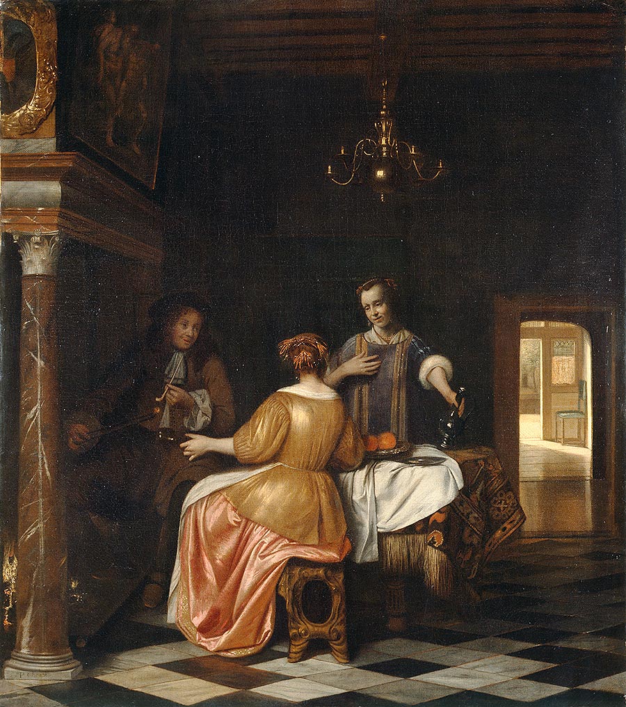
Merry Company – Jacob Ochtervelt (about 1665)
I’m intrigued that this painting has exactly the same title as the previous one.
This is almost certainly accidental. Merry Company was one of the most popular generic headings that were applied to numerous different genre paintings during the Dutch Golden Age. Additionally, the titles of such works do sometimes change to reflect current thinking – this one for example, has been previously known as Interior of an Inn and Violinist and Two Maids.
I’ve heard Jacob Ochtervelt described as one of Holland’s leading genre painters – what was so special about him?
Our painting here reflects fully his refined and distinctive style. The fact that most of the scene seems to be enveloped in shadow draws our attention all the more to those elements that somehow have managed to catch the light and which are also likely to drive the narrative. Most prominently perhaps we notice the long bare neck of the girl to the left and the bosom of the other – as no doubt the young man does. All three faces, have been similarly highlighted as have the Roemer glass, tankard, violin and the alluring fabrics. Finally, Ochtervelt invests this scene with sense of rhythm by portraying the human figures from oblique angles and having two of them incline towards one another. Because he engages our sense of expectation so skillfully, we could almost believe that we were viewing a moving picture.
You point out possible moral messages in the de Hooch painting – but what of this one?
The Dutch in the sixteenth and seventeenth centuries were renowned for their proverbs and a particularly bold example went ‘Inn in Front – Brothel Behind!’. Whilst it would wrong to assume at the outset that we are looking into a house of ill repute, there is no denying that the composition carries an erotic charge. Music, especially when it was being performed as eagerly as it seems to be here, was often seen as a metaphor for seduction and lovemaking. Additionally, there may very well be symbolic significance in the fact that the map on the wall to the left has been partially concealed by an upright mandolin. But the artist has also allowed us a little clue that has clearly escaped the young violinist. The kindly and welcoming smile from one of the young women and the secretive hand gesture from the other, lend a slightly ambiguous quality to their apparent hospitality. The exceedingly hopeful expression on his face would therefore appear all the more amusing – especially when we bear in mind a second Dutch saying from the time: ‘When the wine is in the man, the wisdom is in the can!’
Why were such paintings so popular during the Golden Age?
The dual purpose of genre paintings was recommended in the phrase, ‘For learning and pleasure’. They offered for middle class, mainly Calvinist, homes sources of entertainment and amusement underpinned by moral instruction. At a time when the average middle class annual income was between 500 and 700 guilders, a decent genre painting could be bought for between 5 and 15 guilders. Consequently it would not have been at all unusual for a household to own twenty to thirty such works and according to diarists of the time, even poorer households would also have several.
You’ve mentioned symbolism, hidden meanings and innuendo. You don’t think that perhaps you’re reading rather too much into all this do you? Shouldn’t paintings simply be allowed to be what they are?
You certainly have a point there. The second half of the twentieth century in the Netherlands witnessed a long running debate about the extent to which seventeenth century genre paintings did or did not contain different layers of meaning. However, they certainly had their visual language and we now know that Ochtervelt’s Merry Company was a much more subtle and nuanced response to the highly explicit A Brothel Scene by Leiden fijschilder (literally ‘fine painter’) Frans Van Mieris. In late 2017, that one is due to leave its home in The Hague to hang alongside our Manchester painting as they tour Paris, Dublin and Washington DC as part of a special exhibition.
In our many genre paintings, we see master storytellers at work. In the process, they not only provide us with revealing insights into the values, lifestyles and social conventions of the Dutch Golden Age, they succeed in getting us to ask questions of ourselves. And we find ourselves wondering whether human nature ever really changes.